Thought Therapist
Jo Parsons, The Thought Therapist.
Task:
To create an identity that represents The Though Therapist without falling into the cliché of therapist branding.
Outcome:
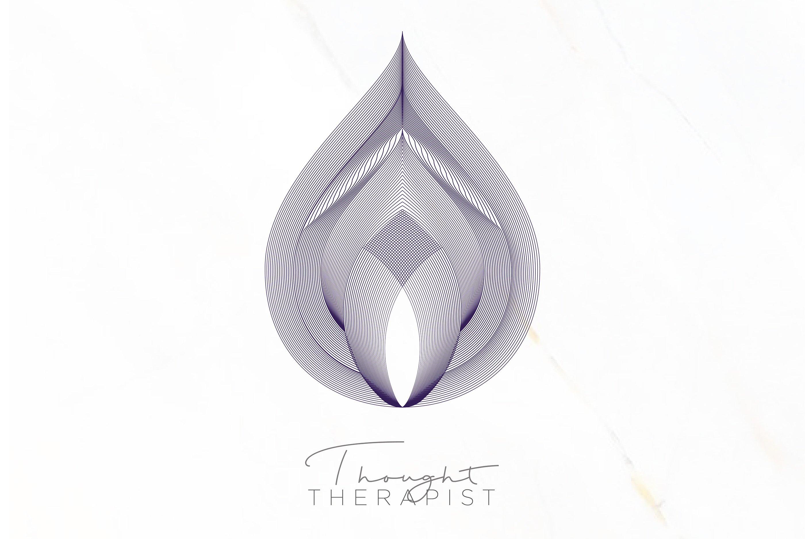
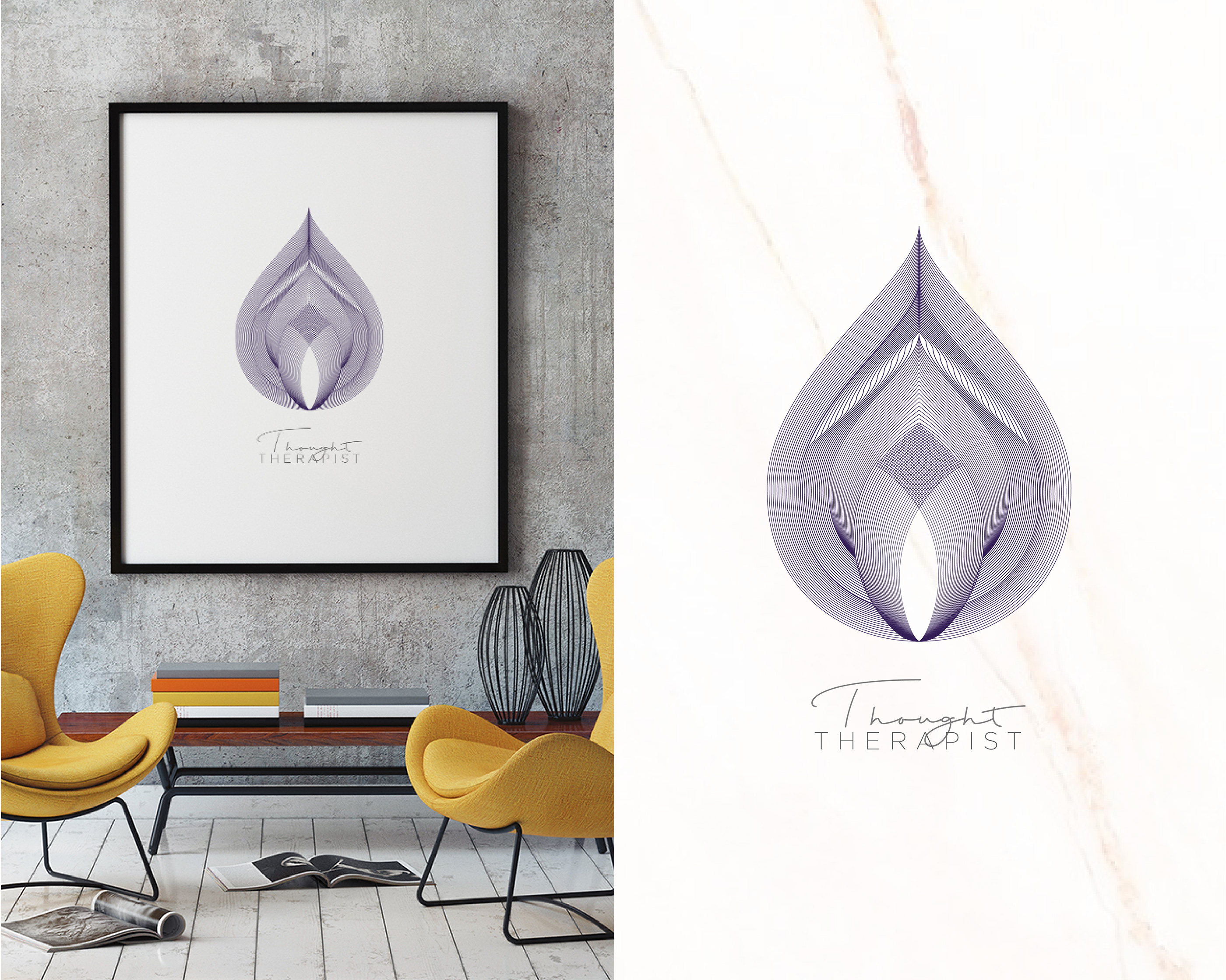
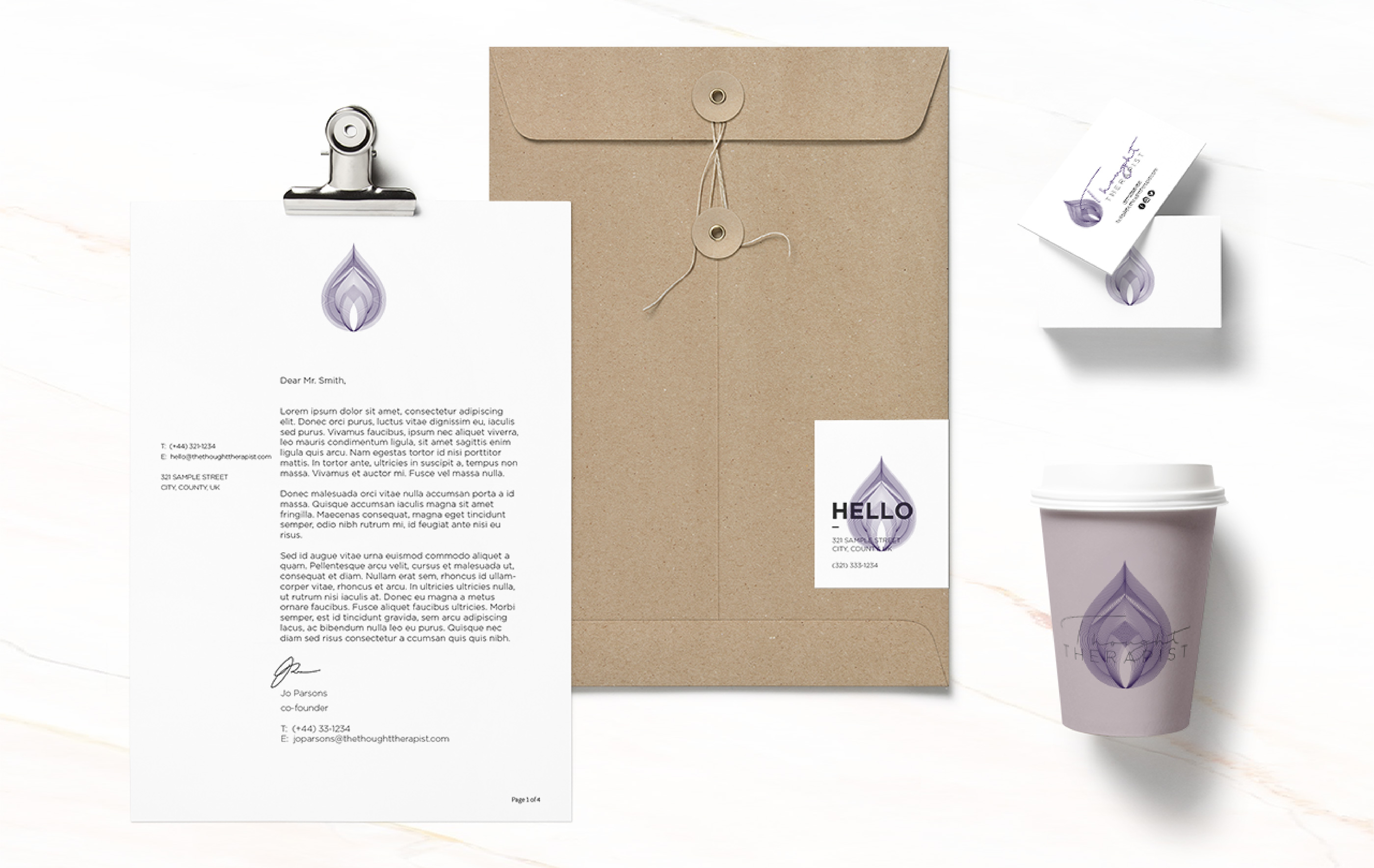
The water drop, as well as being part of the mindfulness symbol, is also known as ‘a lesson of peace’. In taoist tradition, water is considered to be an aspect of wisdom, as it takes on the form in which it is held and moves in the path of least resistance.
The water drop design shows ripples running throughout. What a client forces outward, pushes out like ripples in the water and magnifies as it travels. Everything we do has a rippling effect, reflecting onto others – your attitude, body language, actions and reactions, words, thoughts and feelings. Whether we consciously realise this or not.
The design has perfect symmetry, with one soft shape inside of the other, representing a calm and balanced life.
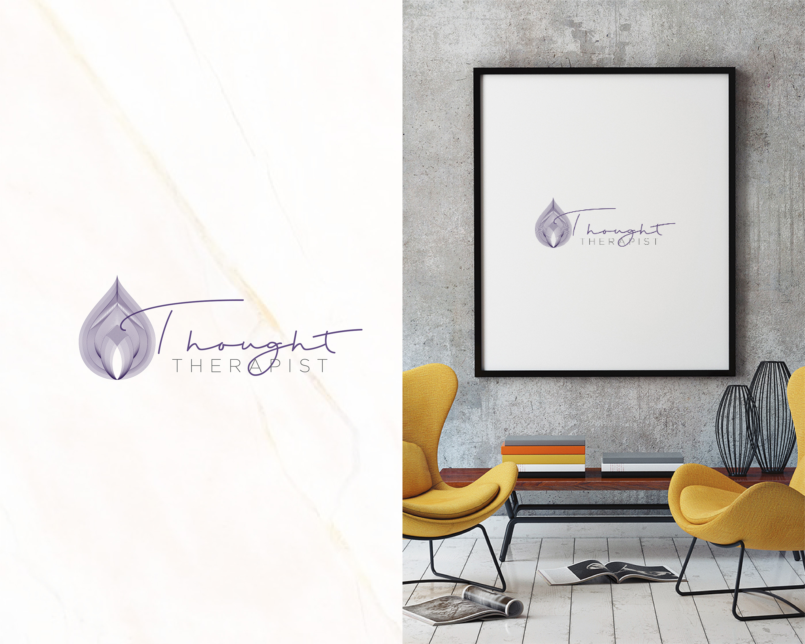
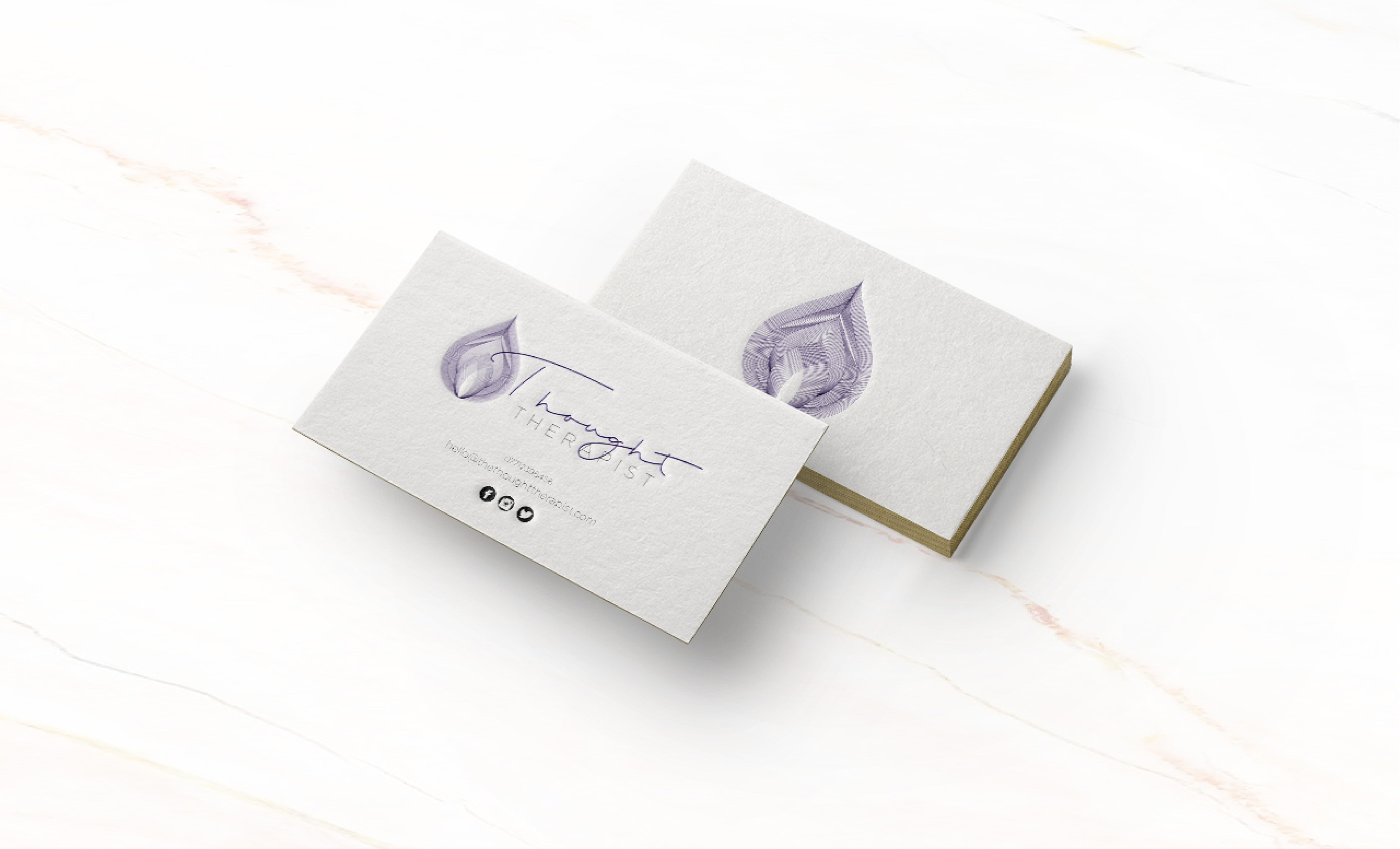
The typography chosen shows two different stories. The word ‘Thought’ is shown in a script font, this shows peoples thoughts, as if it has been scribbled down. The word ‘Therapist’ is shown in a clean, minimal font, this represents the clear mindset that Jo provides for her clients.